Harmonizing information, signage systems and terminology for the Greater Toronto and Hamilton Area’s major transformation in public transit infrastructure.
CLIENT
Metrolinx
ROLE
Designer, KerrSmith Design
SCOPE OF WORK
Research
Engagement
Strategy
Design principles
System Identifier
Graphic design
Industrial design
Pilot Evaluation
Animations
PROJECT DESCRIPTION
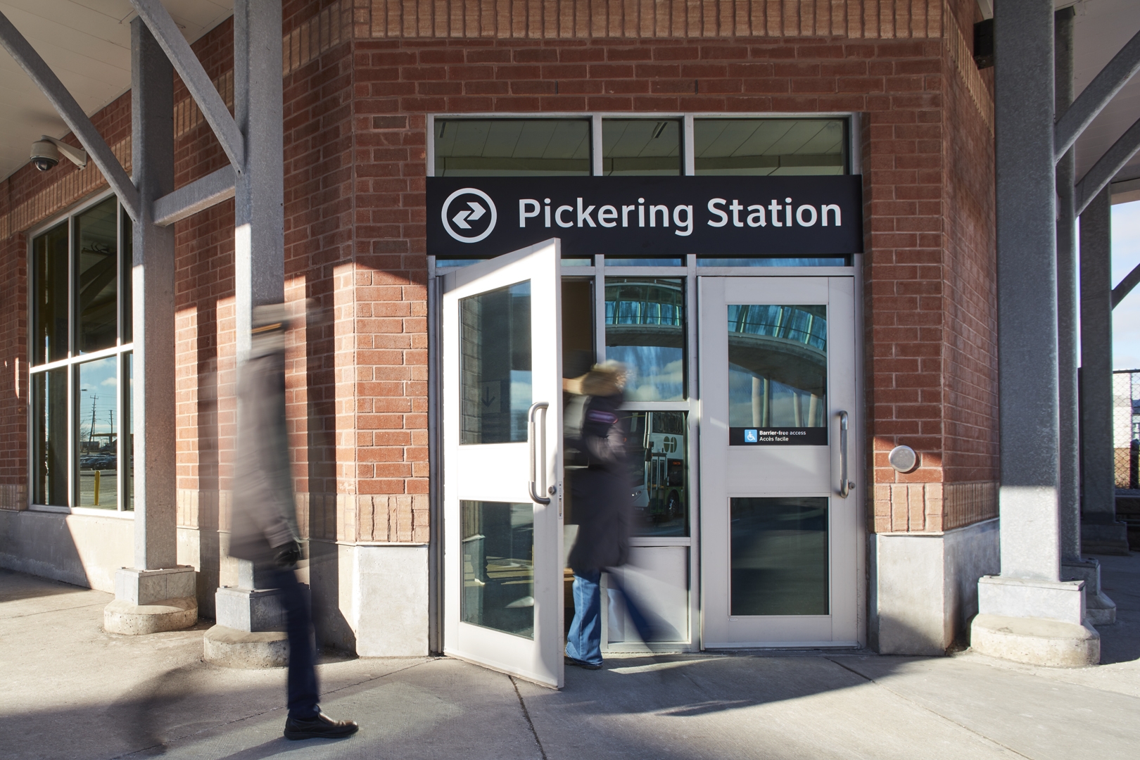
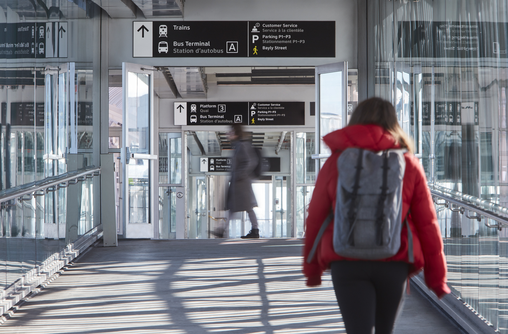
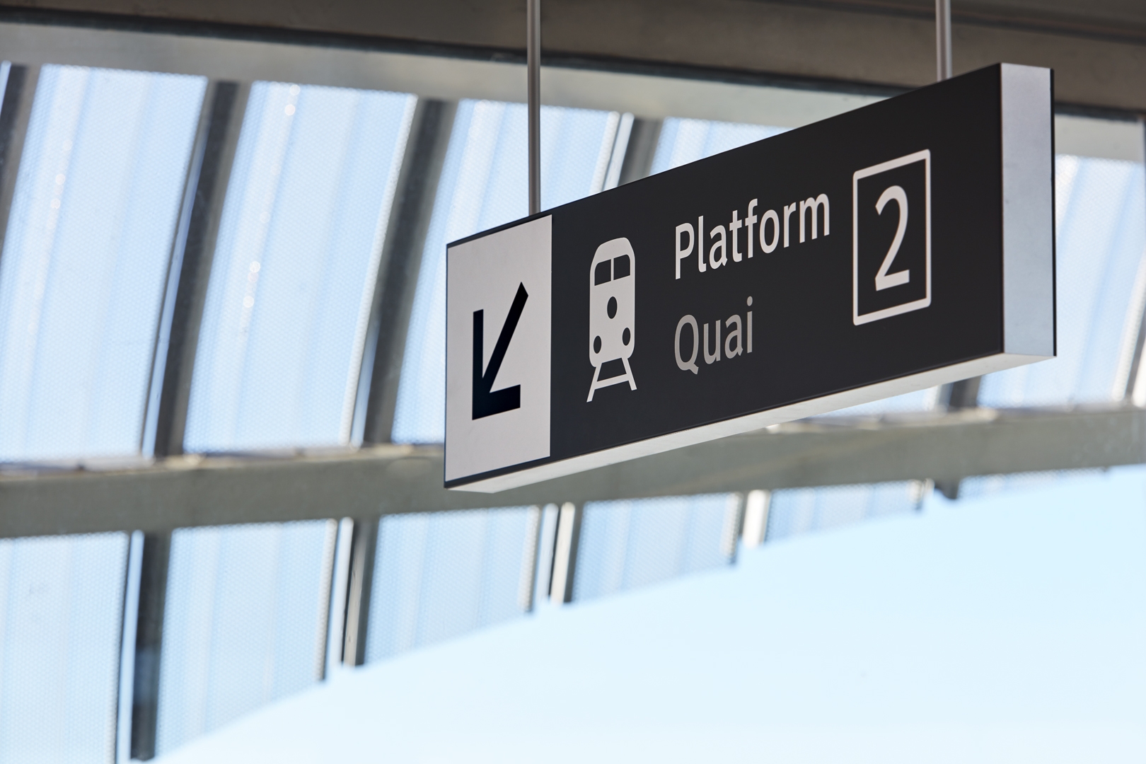
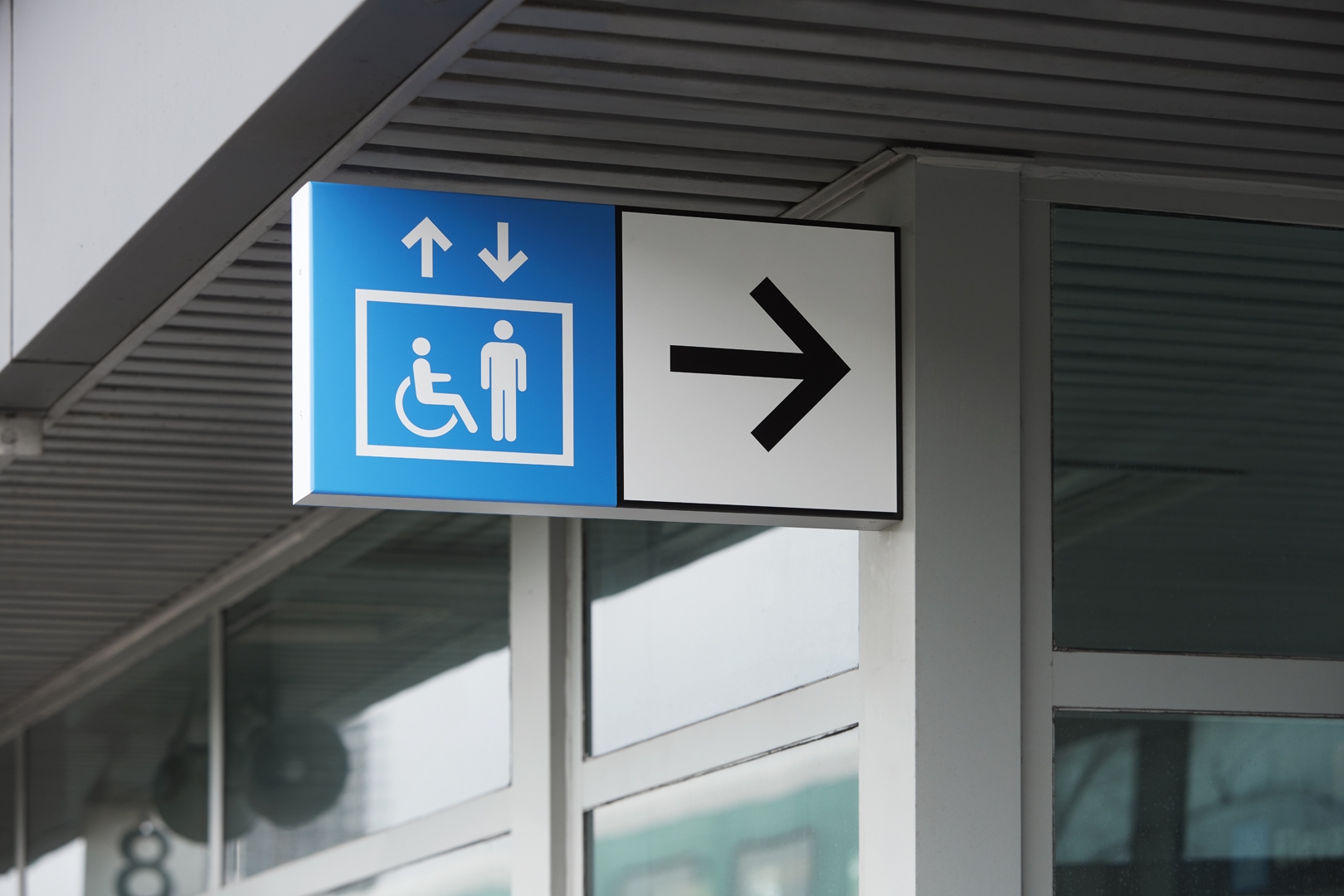
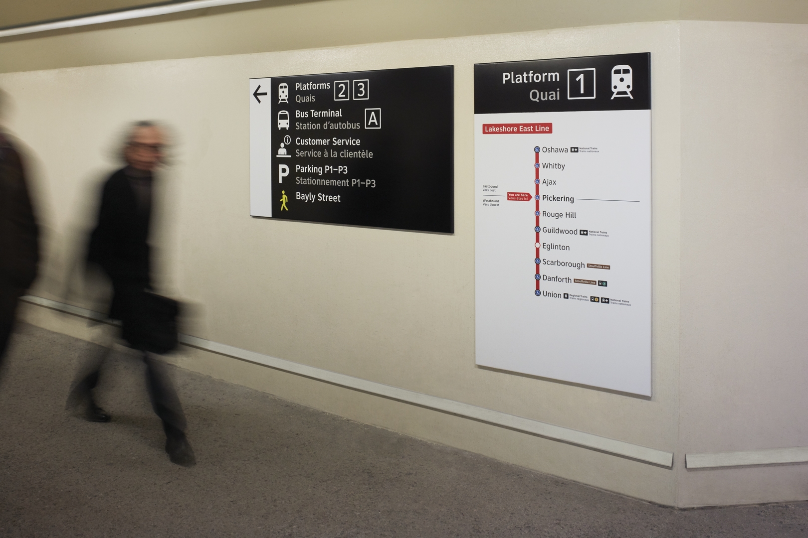
We worked with Metrolinx on a significant wayfinding and information harmonization project for transit across the Greater Golden Horseshoe. In an effort to create a more seamless navigation for those traveling across the Greater Toronto Area, uniting information, terminology and information graphics across the 11 transit systems was essential to create a cross-regional system. The pilot is currently implemented at the Pickering GO station.
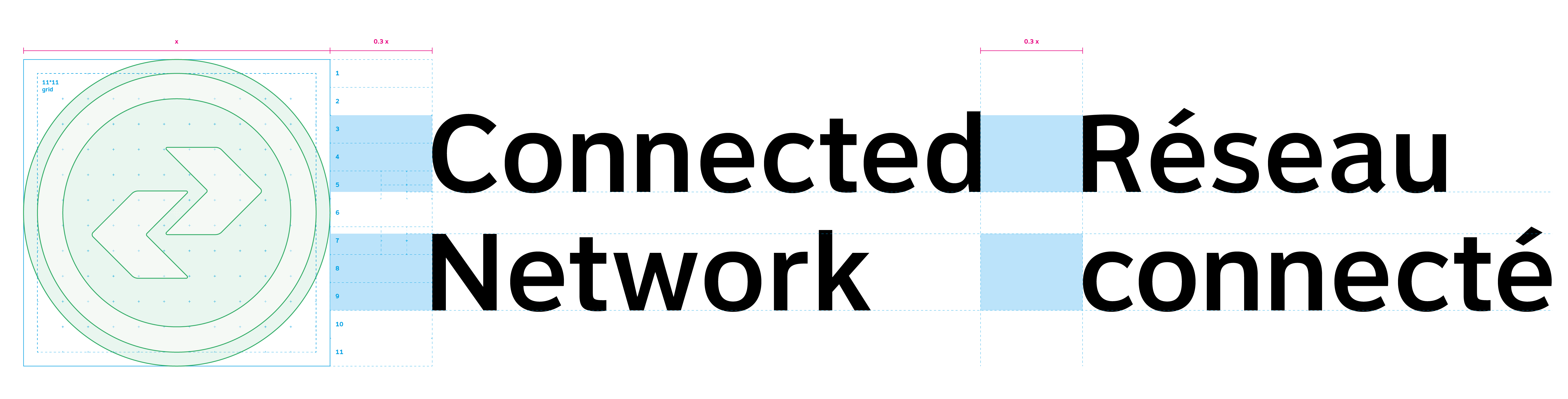
I took part in performing desk research and extracting insights on proper terminology and language that is clear and jargon-free for first-time travelers. Because one station could host multiple transit operators, and brand identities, from adjacent cities, a symbol to
represent “public transit” and “connections” in general was needed. From there, I helped refine this “system identifier” and developed graphics, iconography, signage, posters, brochures and visual guidelines.

Chrysant Jonatan
© Chrysant Jonatan 2022